Textured Text
This is a little complicated, but it can really add visual interest to a text element (especially a heading). The technique involves layering an empty span element (linked to a horizontally tiled background image) over your text. You will need an image of the texture that you wish to show through your text. The image needs to be:- a .png file with alpha-channel transparency
- the same color as your background color.
- It's only suitable for solid background color elements,
- If your background image is taller than the heading, the text will not be selectable.
- IE requires a hack.
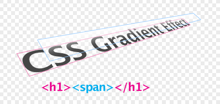
First set up your element in your html. You will need to include an additional empty nested span element.
<h1>CSS Gradient Effect<span></span></h1>Next, style the heading however you like, but make sure that you set position property to relative.
h1 {
   font-size:300%;
   color:#0079b6; /* blue */
   font-weight:normal;
   letter-spacing:-.05em;
   margin:.6em 0;
   position:relative;
   }
Now style the span element. Put the transparent png as a background image for the element (repeating horizontally) and set position property to absolute so it can go above the text.
h1 span{
   position:absolute;
   display:block;
   top:0;
   left:0;
   height:100%;
   width:100%;
   background:url(../images/gradient_1.png) repeat-x;
  }
Graphically, it looks like this:

And this is the result: