CSS
I took the class Using Cascading Style Sheets for Design in Fall 2010. I learned a lot in this class; the homework was excruciating but it really drove home the lessons, also the teacher was very knowledgeable. The focus was on XHTML and CSS3.
I also learned a bit of CSS while taking the HTML/XHTML classes at Foothill - Publishing on the web using HTML/XHTML and Advanced Topics in Web Publishing.
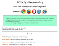
 The image to the left and this link to some homework I did for my CSS class. I really got into fonts while I was
doing this class - I was reading a lot of Jason Cranford Teague . This excercise
was a comparison of different browsers for font and text. So I like the clean presentation of the pages and also I think I made
a CSS discovery
  here by using CSS to produce a kind of reverse writing effect.(You can only see what I'm talking about if you're using a Firefox browser only tho').
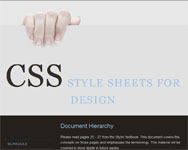
 The image to the left links to a layout practice homework for this course, putting all our little CSS tricks on navigation, positioning etc. I don't really like the
image (No, that is not my hand…I don't like the nails on that lady) but I like the navigation. The links doen't work as they were
just active only for the duration of the class.
I got the template from HTML and CSS Web Standards Solutions A Web Standardistas' Approach
by Christopher Murphy.
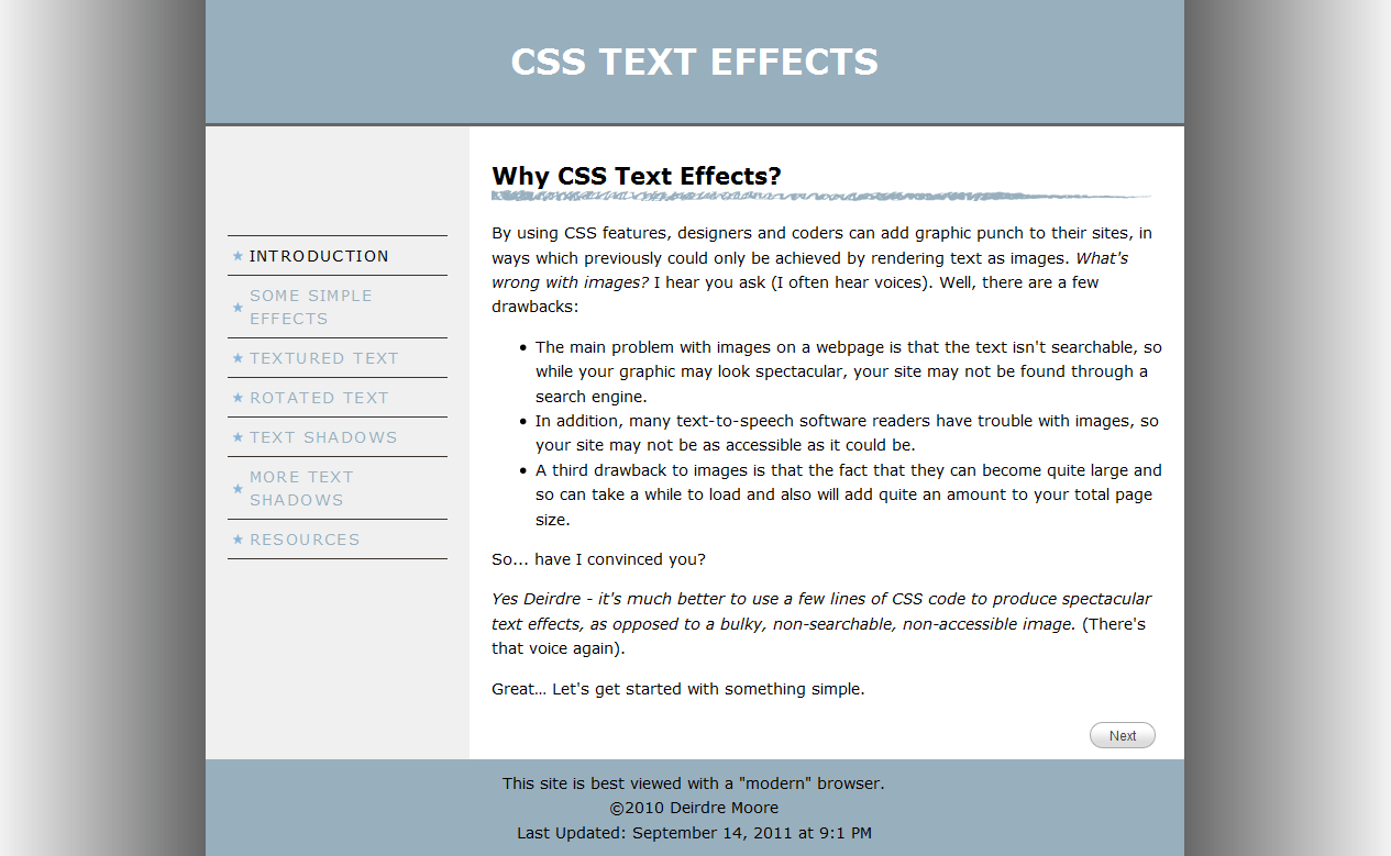
 This webpage and the image to the right link to a project on CSS Text Effects. The task was to research
a CSS technique from the web and present it to the rest of the class. This is where we go round and steal shamelessly from
other sites, it's allowed because it's for an educational thing. I think this is great and got good feedback on this, also learned a lot doing it.
I particularily like the "graphic" calendar and the
 .
.
This is another homework, a way of displaying photos that I took from Zurb Playground. Nice simple effect.
 The image to the left links to my finalproject for my CSS class, so here's where we were to show what we had learned. (I'm really proud of this one, even
tho' it might not look very pretty and it is a bear to load.) The copy is just something from
"Teach For America" - the page design did not necessarily have to have a teaching theme. I started looking
by thinking about doing it in the style of a woodcut, but came around to the idea of a medieval illuminated manuscript.
I truly believe it's the only one in existance, really it's unique. (In fact before I made it I searched around
for something similar so I could copy it but couldn't find anything like it). Of course, the reason
nobody has one out there is because it's impossible for our eyes to read the way words are written in this style.
Altho' after a little while, I must say, I got used to it. Anyway, I'm not happy with the graphics (the border especially,
If I had more time I would have liked to photoshop the background of the borders to match the background of the page). Also
it takes over 10 seconds to load. That is because of the embedded fonts I used (3). I'm sure there must be a way to
streamline that and improve load time. I like the effect of the drop cap on the first-letter tho' - that CSS code is:
#main p:first-letter{
   font-family: "TypographerWoodcutInitialsOne", Georgia, serif;
   color:Olive;
   font-size: 32px;
   float: left ;
   }
I also like the text shadow on the menu mouse-over. The CSS code for that is:
a:hover {
   text-shadow: black 0.5em 0.5em 2px;
   }
Next up - a Zen Garden page in the style of an illuminated manuscript.
